
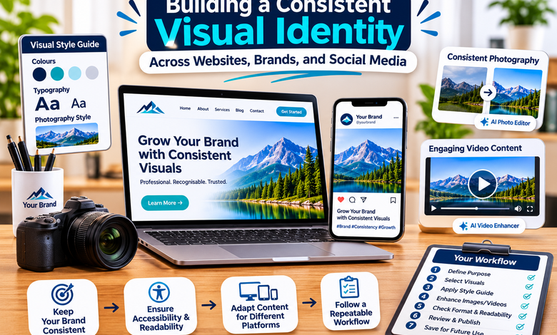
When people visit a website or discover a business on social media, visual presentation often shapes their first impression. Colours, photographs, graphics, and videos all contribute to how an organisation is recognised. Even when the information is useful, inconsistent or poorly presented visuals can make a brand appear less professional.
Building a recognisable visual identity is therefore about more than choosing an attractive logo. It involves creating a consistent appearance across different platforms while making sure every image and video supports the message being communicated. Fortunately, modern digital tools and artificial intelligence are making this process more accessible to businesses, bloggers, and independent creators.
What Makes a Visual Identity Recognisable?
A visual identity is the collection of visual elements that gives a brand or project a distinctive appearance. It can include a logo, colour palette, typography, photography style, illustrations, and graphic layouts.
Consider a business that uses bright colours and simple product photography on its website but publishes dark, heavily edited images on social media. Although each design might look attractive independently, the difference can make the overall brand feel disconnected.
Consistency helps solve this problem. When visual elements follow a recognisable style, audiences can become familiar with the brand’s presentation. This does not mean every image must look identical. Instead, the content should share a few common characteristics that connect different publications and platforms.
A useful starting point is to define a small set of brand colours, choose readable fonts, and decide what kind of photography or imagery best represents the subject. These decisions provide a foundation for future content.
Create a Simple Visual Style Guide
A visual style guide does not need to be a complicated document. Even a short reference sheet can help maintain consistency when creating website graphics, promotional images, and social media posts.
Start by selecting a primary colour and a few complementary colours. These can be used across headings, backgrounds, buttons, and graphic elements. Avoid introducing too many unrelated colours, as this can make designs appear disorganised.
Typography deserves similar attention. Choose fonts that are easy to read on both desktop and mobile screens. A heading font can have more personality, while body text should prioritise readability.
It is also useful to define image preferences. For example, a technology website might favour clean product photography and modern illustrations, while a travel publication may use natural lighting and landscape photography.
Documenting these choices saves time later. Writers, designers, and social media managers can refer to the same guidelines instead of making separate design decisions for every new post.
Use Consistent Photography Across Digital Platforms
Photography is one of the most noticeable parts of a visual identity. Product pages, blog articles, advertisements, and social media posts often depend on images to communicate information quickly.
However, photographs collected from different sources may have inconsistent lighting, colours, backgrounds, or dimensions. Editing can help bring these visuals closer to a shared style.
An AI photo editor can make selected image adjustments easier by using automated features and text-based instructions. Depending on the platform, users may be able to remove unwanted objects, change backgrounds, improve image resolution, or expand an image to fit a different layout.
For example, an online retailer might need product images with a cleaner background, while a blogger may want to remove a distracting object from a photograph before publishing it. AI-assisted editing can help with these tasks without requiring every user to master advanced image-editing software.
IObit’s AI Photo Editor provides online features such as prompt-based editing, object removal, background removal, image upscaling, and image expansion. These options can be useful when preparing visual material for different digital projects.
Nevertheless, editing should support authenticity. Product photographs should accurately represent the items being sold, and images used in informational content should not be changed in ways that mislead readers. Always review the final result before publishing it.
Make Video Content Part of the Brand Experience
Video has become an important format for explaining products, introducing services, sharing tutorials, and presenting stories. A consistent video style can help audiences recognise content even when it appears on different platforms.
Several elements contribute to this consistency. These include colour treatment, framing, background selection, captions, transitions, and the way information is presented. A business that uses a clean and minimal visual style in its photographs can carry similar design choices into its videos.
Technical quality matters as well. Blurry footage, distracting visual noise, or poor lighting can make otherwise useful content difficult to watch. When the original recording is worth keeping, enhancement tools may help improve its presentation.
A video enhancer can use AI to analyse footage and apply improvements such as sharpening, noise reduction, colour restoration, and resolution upscaling. These capabilities can be useful when repurposing older recordings or preparing existing footage for a website or social media campaign.
IObit AI Video Enhancer is an online option designed to improve video clarity and visual quality. It supports common formats including MP4, MOV, M4V, and WebM. Users can upload footage, allow the tool to process it, and preview the enhanced result before exporting.
Enhancement should still be used carefully. Increasing sharpness or resolution does not guarantee that every missing detail will be restored. The final video should look natural and preserve the information viewers are supposed to see.
Adapt Content to Different Platforms
A visual identity should remain recognisable, but content also needs to fit the platform where it appears. A wide website banner, a square social media image, and a vertical mobile video have different layout requirements.
Simply cropping the same image for every platform can remove important details or create awkward compositions. It is better to plan the intended format before editing.
For example, a product photograph may need a square composition for a social media post and a wider version for a website feature. A vertical video may require larger captions and a subject positioned away from interface elements.
Templates can make this process more efficient. Once a brand has established suitable layouts, creators can reuse them while changing the photographs, text, and other content. This helps maintain consistency without making every publication look exactly the same.
Keep Accessibility and Readability in Mind
Good visual design should work for different audiences and devices. A colour combination that looks attractive on a large monitor may be difficult to read on a smaller screen. Text placed over a busy photograph can also become hard to understand.
Use sufficient contrast between text and backgrounds. Keep important information away from the edges of images, where platform cropping may remove it. Avoid placing too much text inside promotional graphics, especially when the same message can be explained in a caption or article.
For website images, descriptive alternative text can help people using screen readers understand the purpose of visual content. Videos should include captions when spoken information is important, allowing viewers to follow the message in different environments.
These practical details improve usability while making content more inclusive.
Build a Repeatable Content Workflow
Consistency becomes easier when visual production follows a clear process. Rather than making every design decision from the beginning, creators can establish a repeatable workflow.
A simple process might look like this:
- Identify the purpose and audience of the content.
- Select images or footage that support the message.
- Apply the established colours, fonts, and visual style.
- Make necessary image or video improvements.
- Check dimensions and readability for the intended platform.
- Review the final material for accuracy and consistency.
- Save approved layouts and settings for future projects.
This approach can reduce repetitive work and make collaboration easier. It also helps businesses maintain a recognisable appearance when several people contribute to their digital channels.
Conclusion
A consistent visual identity helps websites, businesses, and creators communicate more clearly across digital platforms. It begins with a few well-defined design choices and develops through thoughtful use of photography, video, typography, and layouts.
AI-powered editing tools can simplify parts of the process by helping users improve images and footage without requiring advanced technical experience. However, technology alone cannot create a meaningful brand identity. The strongest results come from combining suitable tools with clear design decisions, accurate content, and regular quality checks.
By developing a practical style guide and following a repeatable publishing workflow, creators can produce visual content that feels connected, professional, and recognisable wherever their audiences discover it.




One Comment