
Cyanová: The Fascinating Meaning, Color Codes, and Practical Design Uses
Discover the meaning behind this distinctive blue-green color, its relationship to cyan, and how to use similar shades in digital and print design.

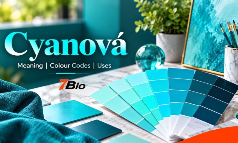
Cyanová is a color-related term associated with cyan, the bright blue-green color commonly used in graphic design, digital displays, photography, and printing. Although the word may sound like the name of an unusual new shade, its clearest meaning comes from Central European languages, particularly Czech and Slovak, where it describes something cyan-colored.
The distinction matters because cyan is an established technical color, whereas Cyanová does not identify a separate, internationally standardized shade with its own universal color code. Anyone using the term for branding, website design, or printed materials should understand the difference between a descriptive color name and a precise technical specification.
This article explains the meaning of Cyanová, its relationship to cyan, its color codes, visual characteristics, related shades, and practical applications in modern design.
What Is Cyanová?
Cyanová is best understood as an adjective describing a cyan color or something with cyan coloring. In Czech, cyanová barva describes cyan coloring, particularly in technical or commercial contexts.
The word is closely connected to the familiar blue-green color called cyan, which appears between blue and green in common descriptions of the visible color spectrum.
However, Cyanová should not be confused with a newly discovered pigment, an independent color system, or an officially established design movement. The underlying color already exists, and the unusual spelling mainly reflects linguistic differences.
English-language websites sometimes use the term more loosely to describe cyan-inspired palettes, soft turquoise shades or bright blue-green visual themes. Such interpretations may be useful in creative discussions, but they are not universal technical definitions.
For an everyday reader, the simplest meaning is a color related to cyan. For a professional designer, the exact color must be identified through an appropriate specification.
The Linguistic Origins of Cyanová
The word’s history begins with cyan, whose name is traditionally traced to the ancient Greek kyanos, a term associated with dark blue coloring and certain blue materials.
Over time, related terminology entered scientific and artistic vocabulary. Cyan eventually became an established color name with important applications in printing, photography, and digital imaging.
The accented ending in Cyanová reflects a different linguistic development.
Czech and Slovak use grammatical gender, and descriptive adjectives change their endings according to the nouns they modify. The form ending in -ová can function as a feminine adjective in appropriate contexts.
This helps explain why the spelling looks different from the English word cyan.
It is also worth recognizing that color vocabulary varies between languages and industries. Czech speakers may encounter other terms, including azurová, when discussing blue or cyan printing colors.
The relationship is therefore linguistic, not evidence of a completely different color category.
What Colour Is Cyanová Exactly?
When the word refers to ordinary cyan, it appears as a vivid, bright mixture of green and blue light.
Pure digital cyan has a recognized value in the sRGB color space. However, the broader term Cyanová does not define a universal shade.
The following specifications describe standard digital cyan, not a separate official Cyanová standard.
| Colour Property | Standard Cyan Value |
|---|---|
| HEX Code | #00FFFF |
| RGB Value | 0, 255, 255 |
| HSL Value | 180°, 100%, 50% |
| CSS Colour Name | cyan |
| Equivalent CSS Name | aqua |
| General Appearance | Bright blue-green |
These values provide a dependable reference when a design requires the exact CSS color cyan.
In RGB notation, red is set to zero while green and blue are both at their maximum values. This creates the vivid appearance associated with pure cyan on a conventional digital display.
These values don’t apply to every turquoise, teal, or cyan-inspired shade. Those colors can vary widely in brightness, saturation, and visual characteristics.
Understanding Cyanová in RGB and CMYK Color Systems
A major source of confusion is the difference between screen colors and printed colors.
Digital screens generally create color through the additive RGB model. Red, green, and blue light combine in different proportions to produce the colors displayed on websites, smartphones, televisions, and computer monitors.
Printing works differently.
The CMYK system uses cyan, magenta, yellow and black inks. Rather than emitting light, these inks absorb and reflect light from the printed surface.
Cyan is one of the fundamental process inks in CMYK printing, making it particularly important for photographs, magazines, packaging and advertising materials.
It may be tempting to assume that the RGB value #00FFFF always converts perfectly into a simple CMYK formula. In practice, accurate printing depends on color profiles, printing equipment, ink characteristics and paper type.
A bright cyan on a monitor may appear more subdued on uncoated paper. Different printers can also reproduce the same digital color differently.
For professional projects, designers should use the appropriate color profile and request a proof when exact matching matters.
Cyanová Compared With Turquoise, Teal and Aqua
Several colors fall into the blue-green family, making them easy to confuse.
Although they may look similar, recognized web color names can represent different numerical values.
| Colour | CSS HEX Code | Visual Character |
|---|---|---|
| Cyan | #00FFFF | Very bright blue-green |
| Aqua | #00FFFF | Identical to CSS cyan |
| Turquoise | #40E0D0 | Softer, slightly greener |
| Teal | #008080 | Darker, more subdued |
| Dark Cyan | #008B8B | Deep, saturated blue-green |
Cyan and aqua are identical in CSS color naming, even though people sometimes describe them differently in everyday conversation.
Turquoise often suggests a more natural or gemstone-inspired look, while teal is considerably darker and works well in restrained color palettes.
Cyanová can be associated with these neighboring shades in informal creative use, but that doesn’t mean they share the same specifications.
Understanding their differences helps designers select colors deliberately rather than relying on descriptive names alone.
Why Blue-Green Colors Are Useful in Modern Design
Blue-green colors offer considerable flexibility because they work well in both highly saturated and muted combinations.
Bright cyan provides strong visual separation from dark backgrounds. It can highlight interface elements, illustrations, diagrams, and important information without relying on red or yellow accents.
Softer blue-green shades offer a different effect. They may create a quieter visual presentation in interiors, editorial layouts, or packaging.
Surrounding colors play an important role in the final appearance.
For example, cyan against charcoal can create a high-energy, technological style, whereas muted blue-green alongside cream or warm grey can create a more restrained composition.
Color associations also depend on culture, context and personal experience. Claims that a particular shade automatically increases trust, reduces stress, or improves purchasing behavior should not be treated as facts without appropriate research.
Good color design depends on context, readability, and consistency, not simply on choosing a fashionable shade.
Practical Uses of Cyanová in Branding and Graphic Design
In branding, a cyan-inspired color can serve as a primary identity color or a supporting accent.
For a technology company, bright blue-green may create a visually distinctive combination with dark navy, charcoal or black. In an editorial publication, a smaller cyan accent can help distinguish navigation elements, charts or section labels.
The key is to use the color consistently.
A brand identity should define the exact HEX or RGB values used in digital materials and, where needed, establish suitable print specifications.
Simply instructing different designers to use Cyanová may produce inconsistent results if each person interprets the term differently.
Graphic designers can also use these shades in backgrounds, illustrations, and gradients. However, highly saturated cyan covering a large area may dominate surrounding content, so balance its brightness with the layout’s purpose.
Using Cyan-Inspired Shades in Websites and Digital Interfaces
Web designers can use cyan for buttons, borders, icons, selected states, and graphical accents.
However, visual appeal must not come at the expense of accessibility.
For ordinary text, WCAG 2.2 Level AA generally requires a contrast ratio of at least 4.5:1, while large text requires at least 3:1.
Pure cyan is a bright color, so dark text generally reads much better against it than white text.
Contrast should still be measured rather than judged by appearance alone.
Designers should also avoid communicating important information through color alone. For example, an error state may require a text label or icon in addition to a color change.
Used carefully, blue-green accents can establish visual hierarchy while keeping the interface readable and accessible.
Cyanová in Fashion and Interior Design
Blue-green shades also work well in clothing, furniture, decorative accessories, and interior color schemes.
In fashion, bright cyan can serve as a statement color, especially when paired with neutral garments. Darker blue-green shades are often easier to incorporate into understated wardrobes.
In interior design, turquoise-inspired cushions, artwork, ceramic objects, or upholstery can introduce color without requiring an entire room to follow the same palette.
Material texture changes the result considerably.
A glossy surface may reflect light strongly, making cyan appear more intense. Matte fabrics and painted walls may produce a softer visual impression.
Lighting is equally important. A color sample examined in daylight can look different under warm domestic lighting.
For this reason, physical samples are more reliable than digital previews when selecting paints, fabrics or permanent finishes.
How to Choose the Right Cyan-Inspired Color
Choosing a suitable shade becomes easier when the design requirements are clear.
1. Identify the application. Decide whether the color will appear on a website, printed package, photograph, item of clothing, or interior surface.
2. Define an exact color value. Use appropriate HEX or RGB specifications for web projects and suitable color profiles or approved references for print.
3. Test surrounding colors. Compare the selected shade with backgrounds, text, images, and supporting accents.
4. Check accessibility and reproduction. Measure text contrast on digital interfaces and examine physical proofs for important print projects.
5. Document the final choice. Record approved specifications so future designs remain consistent.
This approach is more dependable than choosing a shade solely because its name sounds appealing.
Common Mistakes to Avoid
One common mistake is assuming that every reference to Cyanová identifies the same numerical color. The expression is descriptive, and creative uses may vary.
Another error is treating screen appearance as proof of how a color will print. RGB and CMYK systems work differently, so color management is necessary for reliable reproduction.
Designers can also prioritize saturation over readability. Extremely bright accents may attract attention, but they are not always suitable for large text areas or complex interfaces.
Finally, color names should not replace accurate specifications in professional production. Clear documentation prevents confusion between designers, printers and clients.
Conclusion
Cyanová is best understood as a color expression connected to cyan rather than as a separate, internationally standardized color.
Its linguistic background helps explain the distinctive spelling, while the established science of cyan explains its importance in digital screens, printing and visual communication.
For creative purposes, the term may inspire a range of blue-green color combinations. For professional work, however, exact specifications and appropriate testing remain essential.
The most useful approach is to combine accurate color information, thoughtful design, and practical accessibility checks, rather than treating the name alone as a complete technical definition.
FAQs
1. What does Cyanová mean?
Cyanová is a color-related adjective associated with cyan, particularly in Czech and Slovak. It generally describes something with cyan coloring.
2. Does Cyanová have an official HEX color code?
No separate universal HEX code has been established for Cyanová. When the intended color is pure digital cyan, the recognized HEX value is #00FFFF, equivalent to RGB (0, 255, 255).
3. Is Cyanová the same as turquoise?
Not necessarily. Cyanová can describe a cyan color, while turquoise is a related blue-green with its own recognized web color value. The two may look similar but should not automatically be treated as identical.
4. Can Cyanová be used in professional branding?
Yes. Cyan-inspired colors work well in branding, websites, packaging, and marketing materials. Designers should specify exact color values and appropriate print profiles to maintain consistency.
5. Is Cyanová a newly discovered color or design trend?
There is no reliable basis to describe Cyanová as a newly discovered color or a separately standardized design movement. It is better understood through its linguistic connection to cyan and the broader creative use of blue-green color palettes.